Jesse Stowell (Dauphin County) - 1st Place, PA Senate

About Jesse: I live in the great city of Harrisburg with my wife Charity. I enjoy board games, coffee, making fun of our cats, and exploring new places. I serve as a campus minister with InterVarsity Christian Fellowship in Central PA.
Judges' Statement
Jesse puts focus on an extremely important issue, and one that Draw the Lines hasn't been able to honor nearly enough in our statewide awards. Both his House and Senate maps focused on addressing systemic racism, in a novel way. He gathered feedback and extra information beyond what was available in the mapping software. Jesse's map does an in-depth look into how to actually turn "minority representation" into something tangible in a representative number of districts. He created multiple districts that despite not being majority-minority districts, they were at leaset least 30%, which is a sizable impact where those voters can elect somebody who represents their interests, and gives them more statewide power.
Personal Statement
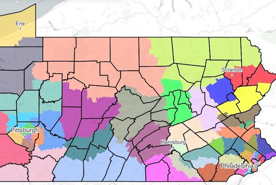
My primary goal is to bring awareness of systemic racism that exists in mapping districts. PA's population is 18% people of color. Yet the Senate map only has 5 (10%) Majority-Minority districts. Even if this is an unintentional "colorblind" approach, it favors white voters.
Because 18% of PA's population is non-white, I hoped to create 18% Minority-Majority districts. l got close (16% in Senate), increasing current Minority-Majority districts from 5 to 8 (one of these, in Pittsburgh, hit a 50% split between white and minority populations). In regions where minority-majority districts were not possible, I aimed to create districts where minorities held the largest percentage possible, while keeping districts at least somewhat compact and close to equal population. This approach led to 3 more districts with higher minority populations than currently exist (at 45%, 34%, and 33%). The Senate is currently so cracked and packed that there are no districts with a 30-55% Minority population.
Overall, my districts are more compact than the current ones. But I still have a few weird shapes - I believe these shapes were needed to combat historic discrimination. Unlike gerrymandering, the point of my maps is not for a particular political party to gain victory: the point is for non-white populations to wield political influence that has been taken. PA, like most of the US, forced non-whites to live in certain areas for much of its history. (For example, redlining and lack of access to FMHA loans established areas where non-whites could not live based on ethnic heritage.) To combat this geographic disenfranchisement, I looked for where I could string together several non-white-majority areas into single districts. This combining of communities could give non-white voters a larger voice in choosing their candidates. The most obvious example of this is my District 3 of Pittsburgh. At only 11% on the Polsby-Popper rating, it's still just as compact as current District 45, which covers some of the same area.
I engaged others in the mapping process by sending a survey for feedback through Instagram, Facebook, and email: https://forms.gle/3sS4FvudjH2NgLGd7 A few friends re-posted the survey and passed it on to others. While no one gave advice on mapping, I did receive a lot of encouragement.
While I worked primarily on de-centering white identity as giving de facto power within districts, the fact that I grouped all other ethnicities as "non-white" isn't helpful long-term, since, of course, not being white is not an ethnicity. I grouped people of color because our current political maps give too much power to white voters. I hope for approaches in the future that continue to consider the ethnic makeup of PA more carefully.