FAQs about the PA Citizens' Map
Why did Draw the Lines produce the Citizens’ Map?
For three years, we’ve had thousands of Pennsylvanians participate in Draw the Lines through our public mapping contests. Altogether, they created 1,500 fully complete congressional maps. Each one was unique. In fact, our contests honored over 100 exemplary maps, each attempting to achieve different goals and coming from Pennsylvanians from different backgrounds. We learned from all of those maps that when given the same type digital tools and data, people can create common-sense district lines that Pennsylvanians can trust. The days of mapping secrecy and naked partisan gerrymandering, which produced Goofy Kicking Donald Duck and other national embarassments, are over.
The Citizens’ Map, on the other hand, represents the “wisdom of the crowd.” The 7,200 Pennsylvanians that helped produce these 1,500 maps provided a framework for how Pennsylvanians believe the commonwealth should be mapped. The Citizens’ Map takes the most common values, statistical benchmarks, and regional trends and reflects it in one map. It sets the standard for how a fair and constitutional congressional map should look. And it sets the table for a shared discussion with the members of the General Assembly as it finalizes PA’s congressional voting districts for the next decade.
This is the first time in Pennsylvania that a map has been produced by such a large swath of citizens. It also does what the General Assembly should do this fall - publish a map and then hold it up for public comment. Our mappers certainly stand ready to help.
What are the values represented in the Citizens’ Map?
We call on the General Assembly to include their map’s story when they publish their map. Here’s ours.
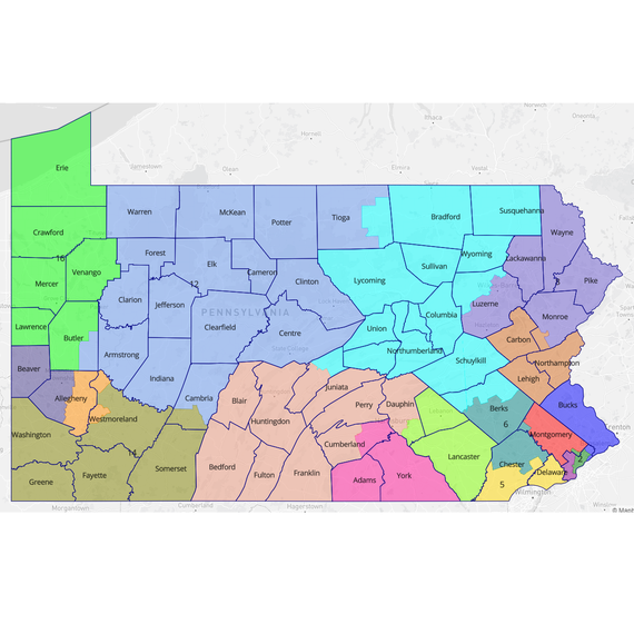
The Citizens’ Map aims to balance the many values that our mappers found to be important. This includes creating compact, competitive districts that minimize county and municipal splits and honor the geographically and culturally distinct regions in Pennsylvania. Further, it aims to honor the requirements of the Voting Rights Act.
This map is far superior to the map drawn in 2011 by the General Assembly, which was done in secret, without any public vetting or comment. We hope the General Assembly will adopt the Citizens' Map, or at a mimum use it as a starting point for their work.
Who drew the Citizens’ Map?
The Citizens’ Map is a collection from over 1,500 different entries to five Draw the Lines public competitions held between the Fall of 2018 and Spring of 2021. Over 7,200 people from all over PA took part in drawing at least a few districts, representing 40 counties and about 90% of the commonwealth’s population.
They are people like:
- Kyle Hynes, a high school student from State College.
- Amanda Duckworth, Aleya Hussain, and Alex Tat, high school students in Philadelphia.
- Lauren Ban, an undergrad at Pitt and a native of Butler County.
- Vincent So, a Temple Upward Bound student in Philadelphia.
- Sarah Buranskas, a nonprofit worker from Pittsburgh.
- Athan Biss, a teacher at The Baldwin School in Montgomery County.
- Ryan Cedzo, a graduate student at Gannon University in Erie.
- Blyden Potts, a sociologist from Cumberland County.
- Isabel Holland and Julia Poulson-Houser, a high school team with different political viewpoints from Lackawanna County.
- Penn State Geography 421, which won a DTL competition by drawing a map using feedback from tailgaters at a Penn State-Ohio State football game.
- Adam Dusen, a farmer from Bucks County.
- Students from Roman Catholic High School and the Franklin Institute STEM Scholars program in Philadelphia.
There are many more Pennsylvanians with stories like these. You can see our favorite entries and read their stories on our competition pages.
DTL created a rough outline of the Citizens' Map (more on that below). Then our Citizen Map Corps, an elite group of former competition winners from all over the Commonwealth, went through numerous iterations before drawing the final lines. DTL also shared the map for feedback with diverse stakeholders around PA, including voters loyal to both parties. We did not share it directly with party officials or electeds - they will see it just like the rest of the public.
Thus, the Citizens' Map was not only created by thousand of mappers, but it has been rigorously vetted. The General Assembly should follow this example.
Did an algorithm draw the Citizens' Map?
Nope. Every single entry to Draw the Lines, all 1,500+ of them, was uniquely drawn by each mapper or team using freely available mapping software. This software measured districts by a set of metrics that gave a snapshot of how good the map looked quantitatively. Each mapper also declared which values mattered most to them when drawing a map, and they wrote or recorded a narrative accompanying their districts.
Draw the Lines took the 1,500 entries and created a statistical summary to understand what values mattered broadly to Pennsylvanians, and what were the baseline metrics that a good map should achieve.
Further, after having looked at all of these maps and conducting over 300 events in communities across Pennsylvania since 2018, the Draw the Lines team developed a sense of the regional trends that Pennsylvanians want to see in their maps. For example: Northampton and Lehigh County want to be kept together as part of the Lehigh Valley. Scranton and Wilkes-Barre are a cohesive community and should not be split. Erie County is the anchor of a northwest district, and that district should flow south down the I-79 corridor. Splitting Philadelphia down Broad Street is a common practice.
Is this map better than the districts created by the General Assembly the last time they did this, in 2011?
Yes, and it’s not particularly close:
- It splits half as many counties (14) as the 2011 map (28)
- It is more than twice as compact, achieving a 37% Polsby Popper score, versus 16%.
- There are six solidly competitive seats, while the 2011 map averaged just one race each election from 2012-’16 (‘competitive’ defined as candidates from the two major parties finishing within 10% of each other).
- There are two majority-minority districts, including one majority Black. This meets the VRA standard that has been met in previous cycles.
- This map is very strong on common sense regional groupings. The Lehigh Valley, the Laurel Highlands, culturally cohesive neighborhoods in Philadelphia, the Scranton/Wilkes-Barre area, the Susquehanna Valley, the Capital Region, the I-79 corridor south from Erie, and most of the Pennsylvania Wilds all have their own districts.
Does the map take incumbent addresses into consideration?
One of the most common values we heard from mappers throughout this process was that incumbents should not be protected with new maps. We largely agree with the sentiment. However, some have argued that previous congressional maps are well-known, and dramatically changing them could create some confusion among voters when they go to the polls for the first time under the new maps. Thus, the Citizens' Map attempts to accommodate both of those values.
Why is Pittsburgh split?
The map does its best to minimize municipal splits along with county splits. Again, there are always some trade-offs to be made. In this case, DTL mappers often created a clear district line between Beaver County and Washington County on PA’s western border. Further, many mappers put Butler County in a district with Erie (CD16). The Citizens’ Map does the same on both accounts, and to ensure only a single county split in Allegheny County, it requires CD17 to amass a large enough population that it goes into Pittsburgh to meet the population requirement.
We heard from several public commenters that splitting Pittsburgh is not ideal. However, many of our mappers, including those in the area, used natural boundaries in the city to divide their districts, particularly at Point State Park where the Three Rivers come together. That's where the Citizens' Map divides District 15 and 17.
Is it necessary for every district to have almost exactly the same number of people?
Using the principle of "One person, one vote," courts have generally ruled that every congressional district needs to have exactly the same number of people in them.
Draw the Lines believes that requiring every district to have the exact same number of people in them sets a standard for false precision. People are born, die, and move every day. It’s unfortunate that this requirement exists often at the expense of other values, like limiting political subdivision splits or maximizing compact districts. Most troublesome, the Citizens’ Map demonstrates that to get to zero population deviation, a map must split numerous precincts, which creates serious election administration concerns at the polling place on Election Day.
Draw the Lines produced another map, with the same characteristics, that splits no precincts. The population deviation is only 0.24%, well within a SCOTUS precedent. We would encourage the General Assembly to pass a statute allowing for up to a 0.75% population deviation in a congressional map.
How can I use this map to advocate for a better congressional map this year?
We encourage you to sign up to testify at the hearings that are currently scheduled for the House State Government Committee. There, you can hold this map up as an example of what a large and wide range of Pennsylvanians think about the process. Showing the committee members a map that has already been drawn will give them tangible feedback that will be much more helpful to them than vague statements on fairness, transparency, and keeping communities together.
If you can’t testify in person, you can use the House’s redistricting website to provide input on either the old redistricting maps or the Citizens’ Map. Tell them what you like about the map, and what you would change.
And of course, contact your legislator directly. Ultimately, every member of the House and Senate will have to vote on a redistricting map. You can point out that the Citizens' Map shows how over 1,500 Pennsylvanians think the districts should look. It's been vetted and lives on the DTL website for public comment. Encourage the General Assembly to use this map as a starting point and produce a draft map in similar fashion. It's vital for the public to be able to react to a map before it is voted on.